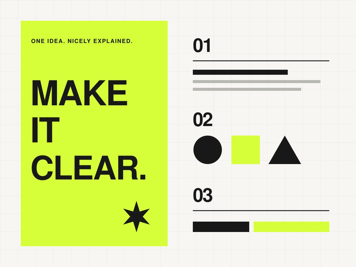
An infographic is a little guided tour of an idea. Your reader should know where to look first, understand the point and leave with something useful. The tempting part is choosing colours. The useful part happens just before that.
1. Finish this sentence
‘After seeing this, someone will understand…’ Keep the answer specific. ‘How to prepare a newsletter in six steps’ is a workable brief. ‘Everything about email marketing’ is a small textbook trying to squeeze into a rectangle. Choose one audience, one question and one main takeaway.
Collect the facts before you choose the layout. For every statistic, keep its source, date, definition and relevant context. Do not turn an estimate into a precise-looking chart. If you have no numbers, that is fine: a process, comparison or checklist can make a useful infographic without any.
2. Give the information a shape
| Your material | A sensible starting layout |
|---|---|
| A sequence of actions | Numbered steps with a clear reading direction |
| Two approaches | Side-by-side columns using the same criteria |
| Parts of a whole | A labelled breakdown, with values that actually form a whole |
| A single comparison | A simple chart with a descriptive heading and units |
Sketch the boxes on paper. Put the main message at the top, supporting detail in the middle and sources at the bottom. If the story only makes sense when you explain it aloud, adjust the structure before adding decoration.
3. Pick the tool for the job
Canva’s infographic maker offers templates and a drag-and-drop editor: a useful starting point for a process guide or visual checklist. Replace the placeholder text first, then remove elements that no longer serve the idea. Check which assets and export options belong to your plan.
When numbers are doing the work, look at Datawrapper’s chart tools. Its options include labels, annotations and responsive charts. Choose the chart for the comparison you need to communicate, rather than the one that looks most unusual.
4. Edit until the page has a clear rhythm
- Use a small type hierarchy: title, section heading and body text.
- Give every colour a job. Use the accent to direct attention, then let it rest.
- Label the important parts directly. Do not make colour the only way to distinguish them.
- Keep units, date ranges and sources visible. Those details are part of the story.
- Leave space between groups so the reader can see what belongs together.
5. Do the phone test
View the exported graphic at the size someone will actually see it. Can you read the smallest label without zooming? Is the first step obvious? A long graphic may need several smaller panels for social media. On a website, include the key information as text as well, so the message is available beyond the image.
Ask someone to describe the takeaway without prompting them. If they notice the colours but miss the point, revise the hierarchy. Your finished graphic should make the idea easier to understand, not simply more decorated.
A tiny brief to try today
Make a six-step guide called ‘From idea to newsletter’: choose the topic, outline, draft, edit, send a test, publish. Use six short labels and one sentence per step. This example needs no invented data and no decorative chart. It needs a clear path. Once that works, you can give it some personality.